CNC Relief Tile Project

Overview
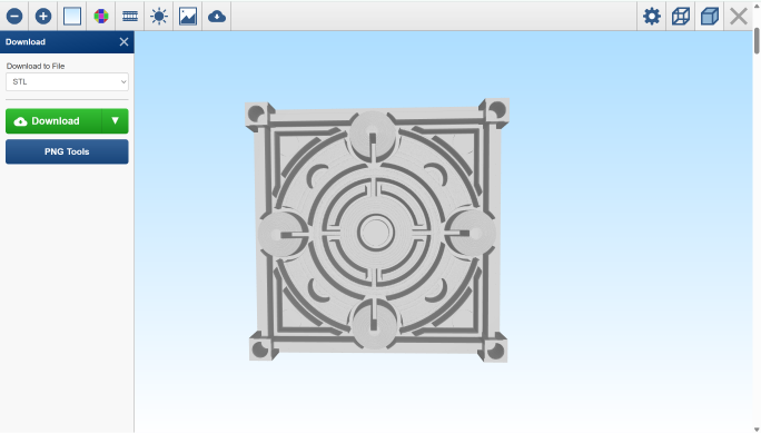
The aim of this project was to take a flat gray scale image into a 3D tile using a CNC mill. The goal was to explore isomorphism, how the same visual idea can live in two different forms: one as a digital 2D graphic and one as a physical, carved surface. I started in Illustrator, converted the image to an STL with ImageToSTL.com, and then milled it out of MDF on the CNC machine. The final result is a tactile version of a graphic tile.
Design & Digital Process
I built the design in Illustrator, mostly working with circles, arcs, and geometric cutouts. I used grayscale values to set the depth—lighter = higher, darker = deeper. I tried to create something that would translate well in 3D while still feeling balanced and composed as a 2D image.
Once I had the image, I uploaded it to ImageToSTL.com, which basically turned the brightness of each pixel into height data. After a few test runs, I landed on settings that gave me good contour and preserved most of the details.
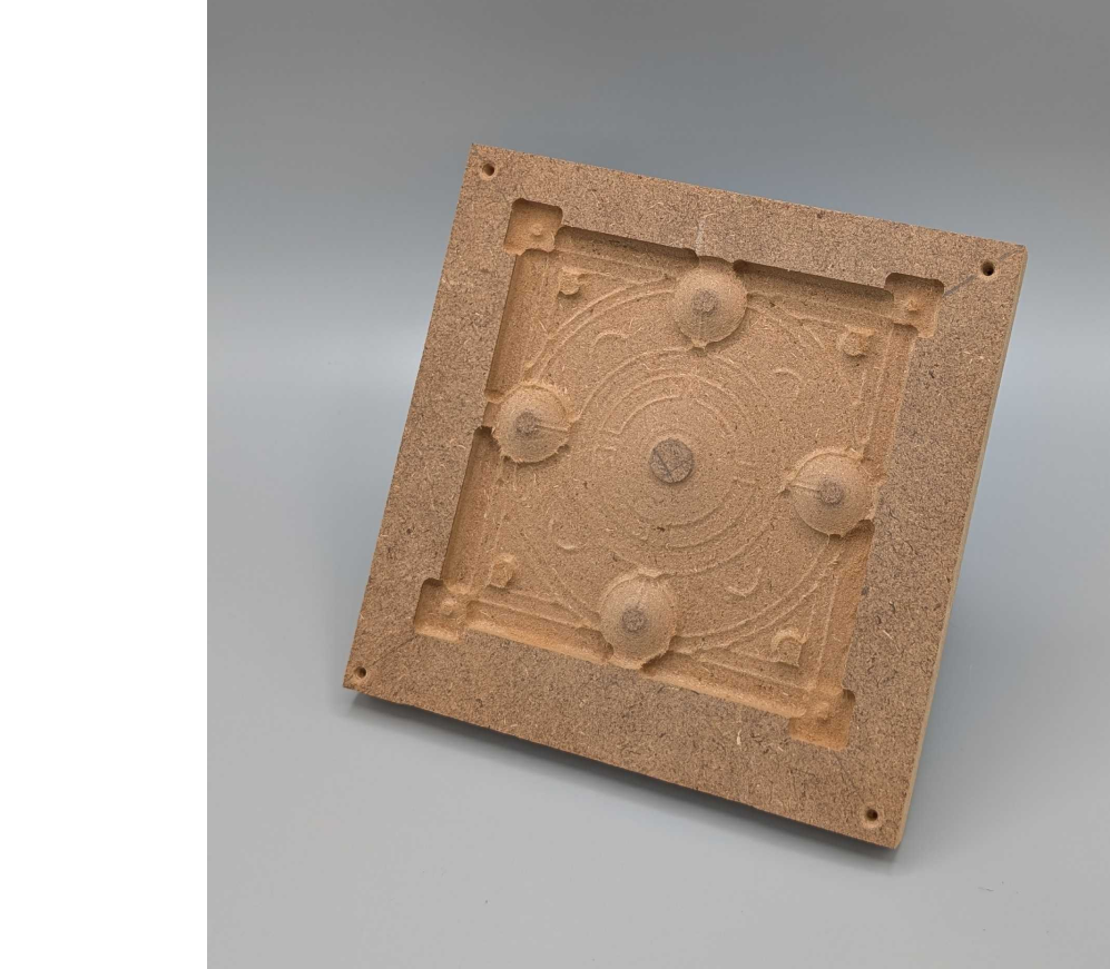
Then I pulled the STL into Z Carve to generate tool paths. That’s where I started running into limitations—I didn’t get to do a roughing pass, which meant I had to keep the toolpath pretty simple. I also had to use a bit that was bigger than ideal, and it really showed in the finer details.

CNC Milling & Fabrication
I used the ShopBot desktop CNC to cut into MDF. It milled fine overall, but without a roughing pass and with a bit that size, a lot of the tight curves and stroke outlines didn’t come through the way I’d hoped. The carved version feels flatter in areas that were supposed to pop more, and some of the layered stroke work got lost entirely.
Still, the basic form came through. You can see the circular structure and the hierarchy of layers—even if it’s not as crisp as I imagined. The tile feels like a hybrid between decorative and mechanical, which is kind of the vibe I was going for anyway. Reflection
Reflection